
By Nabin Ghimire, Flutter Developer & Computer Engineer in Kathmandu, Nepal
Published
Updated
10 min read
My cursor was blinking on an empty create-next-app prompt, and I had a slightly stupid idea: ship a dark-theme, animation-heavy portfolio before I went to sleep that night. No Figma file. No 40-tab design research spiral. Just me, Claude Code, and one working day of about 8 to 10 hours at the keyboard. By hour 10 of actual keyboard time the site was deployed, indexed, and passing Lighthouse with a smug little green circle. Here is exactly how it happened, warts and broken easing curves included.
Section 1: What "Vibe Coding" Actually Means (And Why I Decided to Try It)
'Vibe coding is not letting AI write my app and hoping for the best.' It is closer to directing. You hold the architecture in your head, you describe the intent, and the model types the characters. I told Claude Code things like:
prompt: set up a hero with a three-tier typography hierarchy, clamp()
based fluid sizing, and a contrast ratio that clears WCAG AA on #0a0a0a
It understood. It scaffolded. I reviewed the diff like a skeptical tech lead reviewing a junior's PR, because that is literally what it is.
The distinction matters. Vibe coding fails when you outsource decisions. It works when you outsource labor. I still chose every easing curve, every color stop, every scroll trigger. The model just saved me from retyping boilerplate I have written ten times before.
So I set the challenge:
Build a sleek, modern, interactive dark-theme portfolio in a single day: 8 to 10 working hours.
Constraints I gave myself:
- Real content, crawlable HTML, no client-side text rendering nonsense
- Motion that respects
prefers-reduced-motionfrom day one - A build that finishes clean, or the challenge is void
Section 2: The Core Tech Stack Selection
Every tool earned its slot. Nothing on the list is there because it was trendy on Hacker News this morning.
- Claude Code + Tailwind CSS: AI-assisted scaffolding is only as fast as your styling feedback loop. Tailwind v4 (no config file, tokens living in
globals.cssunder@theme inline) meant every prompt produced CSS I could visually verify in one hot reload. I writebg-card, the model writesbg-card, we both move on. - GSAP (GreenSock): For high-end micro-interactions and what I think of as element entrance physics. CSS transitions handle hover states fine, but scroll-linked timelines, staggered word reveals, and pinned horizontal sections need a real engine. GSAP's ScrollTrigger plus SplitText gave me cinematic control with about 30 lines per effect.
- Lenis smooth scroll: Native scrolling on a trackpad feels like dragging a filing cabinet. Lenis interpolates scroll position with a lerp, which makes every ScrollTrigger tick feel buttery instead of steppy. Silky page movement is the difference between "portfolio" and "demo reel".
- Next.js + React 19: App Router for file-based routes, static prerendering for every page, and a one-command deploy. React 19's compiler meant I never hand-memoized anything during the sprint. Performance was free; I spent my attention elsewhere.
Total install weight was manageable, and every piece solved a problem I actually had.
Section 3: The One-Day Build Timeline (8-10 Working Hours, Step-by-Step)
These are keyboard hours, not clock hours: breakfast, walks and waiting on builds do not count, which is why the timeline ends at hour 10 even though everything lived inside one calendar day.
Hour 0 - 2: Wireframing with AI
I skipped Figma and wireframed directly in JSX. Claude generated section skeletons (hero, project grid, about, contact) while I dictated the hero typography hierarchy: a clamped display size up top, a muted subtitle, then a mono accent line for the role.
First real bug of the day: my muted gray on the dark surface landed at a contrast ratio of 3.1:1. Unacceptable. I nudged the token lighter and had the model audit every text/background pairing in the file. That loop (generate, measure, fix) took twenty minutes and would have taken me an afternoon by hand.
Hour 3 - 5: GSAP timelines and scroll triggers
This was the fun block. I established one rule early: all GSAP imports flow through a single registration file, so plugins get registered exactly once.
- Entrance animations use
useGSAPfrom@gsap/react, scoped to a ref, so everything reverts cleanly on unmount - Every timeline runs inside
gsap.matchMedia(), so desktop and mobile get different choreography without spaghettiifstatements - Easing lives in a shared tokens file (
EASE.expoeverywhere). Nobody hand-typescubic-bezier(0.16, 1, 0.3, 1)at 3 AM. Nobody.
The trick that kept SEO intact: server-render content visible first, then apply the GSAP "from" state at runtime. The HTML is complete without JavaScript; animation is a garnish, not the meal.
Hour 6 - 8: Lenis integration and dark-mode polish
Wiring Lenis took one provider component: instantiate on mount, drive it from a single requestAnimationFrame loop, and sync ScrollTrigger on every Lenis scroll event. Skip that sync and your triggers fire at random scroll offsets, which is exactly the kind of bug that makes you question your sanity for an hour.
Then the color work. I audited the dark-mode color scale as a system, not as individual hex codes:
- One background, one elevated surface, one border token
- A single brand accent used at 10% opacity for glows, full strength for text
- Zero raw hex values in class names, ever
Tokens beat eyeballing. When the palette shifted, it shifted everywhere at once.
Hour 9 - 10: SEO, schema, and cross-browser hardening
The unglamorous hours, and honestly the most valuable ones:
- Metadata: title and description per route, canonical URLs, Open Graph images at a real 1200x630
- JSON-LD schema: Person, WebSite, and BlogPosting structured data, emitted server-side so Google reads it in the raw HTML
- Responsive pass: iPhone SE up to an ultrawide, plus Firefox and Safari (Lenis and iOS Safari have history, test it)
- A
npm run buildthat exits clean, plus a broken-link crawl
Midnight hit somewhere around the schema debugging. Worth it.
Section 4: Visual Tour & Screenshots Guide
Text is fine, but you came for the pixels. Here is where the images slot in:
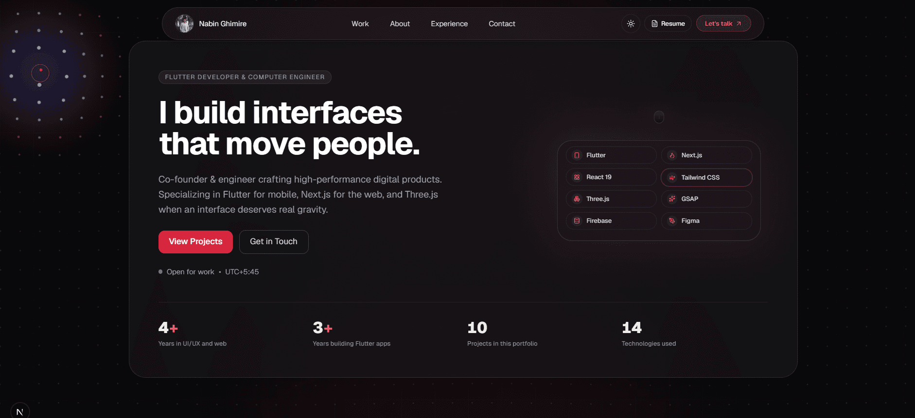
The hero is a study in restraint: one massive headline, one supporting line, and a row of tech pills (Next.js, GSAP, Lenis, Tailwind) sitting under a soft brand glow.
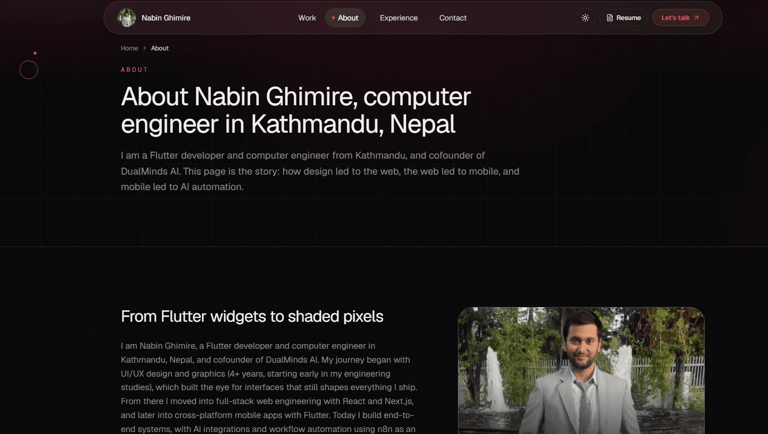
The about block keeps the same restraint: portrait, short bio and direct contact actions, so readers meet the person before the project grid.
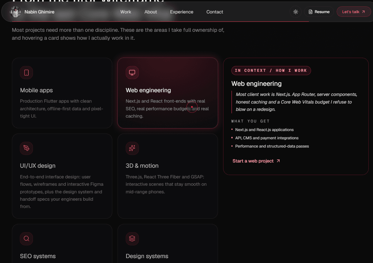
Then the skills grid: grouped cards instead of a flat list, so the stack reads as capabilities rather than keywords.
Those three screens tell most of the story. The rest of the page follows the same pattern: pinned project sections, smooth scrolling, and a theme system that stays consistent across every route.
Section 5: Key Lessons & The Future of Portfolio Building
Here is the number that surprised me: AI handled roughly 70% of the raw code volume, but that flipped my time budget in the best way. Boilerplate (routing, form plumbing, config, metadata scaffolding) collapsed from hours to minutes. I spent about 90% of my active coding time on the things that actually separate a portfolio from a template:
- Micro-interactions: the exact stagger on a word reveal, the glow that trails a hover by 80ms, the counter that eases out instead of snapping
- Accessibility: focus-visible rings, skip links, aria-hidden decoration, and reduced-motion fallbacks that leave all content readable
- Performance: capped device pixel ratios, lazy-loaded 3D, no per-frame allocations in the render loop
- Design detail: contrast ratios, type scale consistency, spacing rhythm
Three lessons I am taking forward:
- Direct, do not delegate. The model is a phenomenal typist and a mediocre art director. Keep the taste in your own head.
- Guard rails are the real skill. Typed data layers, single registration points for plugins, and build-time checks are what let AI move fast without the codebase turning into soup halfway through the sprint.
- The last 10% is the product. Anyone can generate a landing page in an afternoon. The polish pass is where a recruiter decides you actually care.
Two older builds carry most of the practice this sprint cashed in. The solar system 3D portfolio is where Three.js, React Three Fiber and scroll-driven camera work finally clicked, and mblportfolio is where the polish habits stuck. Worth saying plainly: mblportfolio is a regular website, not a mobile app. It just presents the whole portfolio inside mobile-device mockups so phone layouts can be reviewed on a desktop screen.
Is this the future of portfolio building? For me, yes. Boilerplate is turning into a commodity, and the human work is shrinking down to the parts that were always the interesting parts: judgment, restraint, and the weird little details nobody asked for but everybody notices.
Now go set a one-day clock. You will be surprised what fits inside 8 to 10 hours.